The Best Restaurant Color Schemes for 2025 Inspire and Impress
Trending Color Palettes for Restaurant Design
In the ever-evolving world of restaurant design, color plays a pivotal role in shaping the dining experience. As we step into 2025, the palette of popular colors continues to shift, influenced by changing tastes, cultural trends, and psychological insights. From bold, saturated hues that energize patrons to soft, soothing pastels that create an air of calm, restaurateurs have an exciting range of options to explore.
In this blog, we'll dive into the latest color trends transforming restaurant interiors, exploring how these choices impact ambiance, customer perception, and even appetite. Whether you're a restaurant owner looking to refresh your space, a designer seeking inspiration, or simply a curious diner, join us as we paint a picture of the vibrant world of restaurant interior colors.
The Power of Bold Colors in Dining Spaces
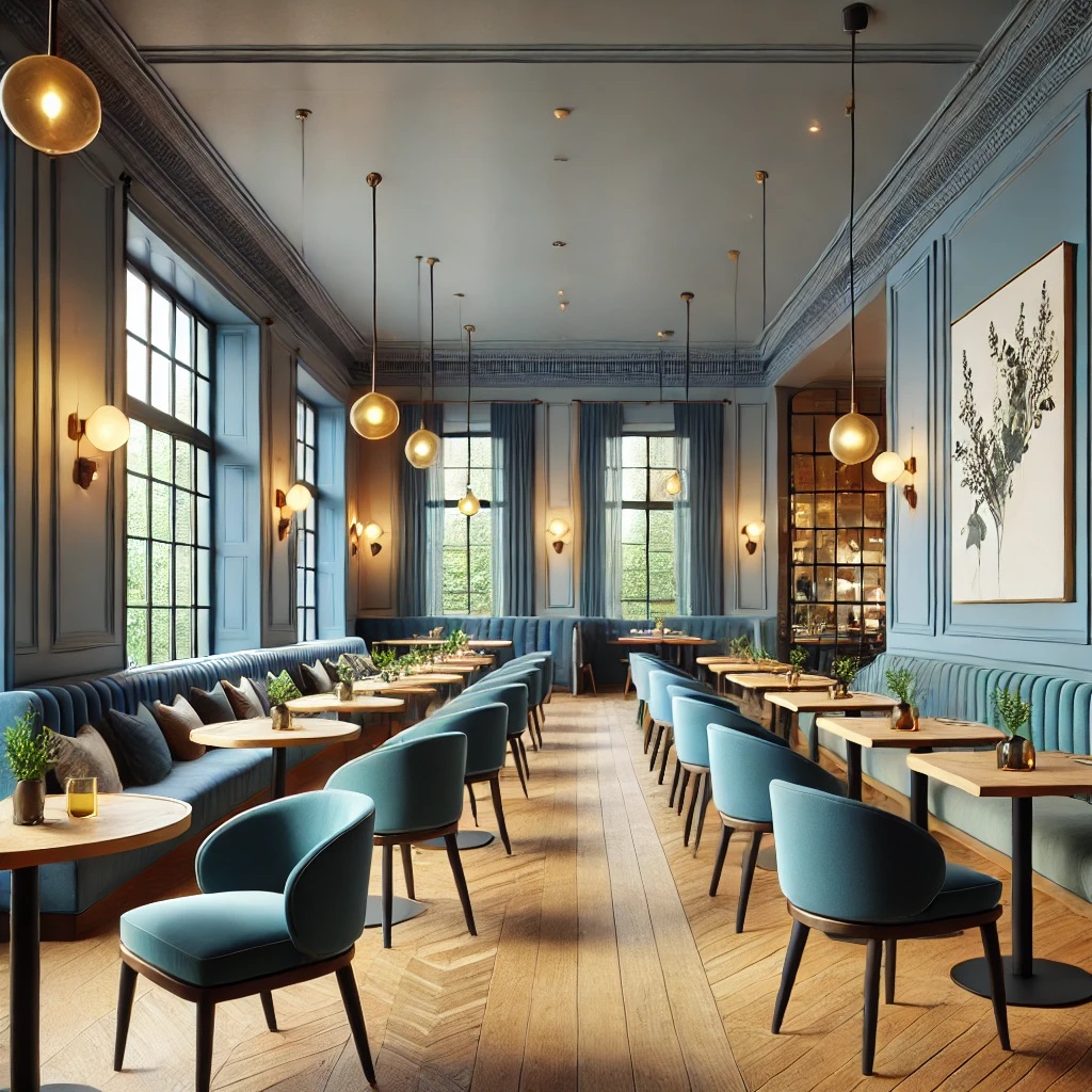
Deep Blues: Elegance and Sophistication
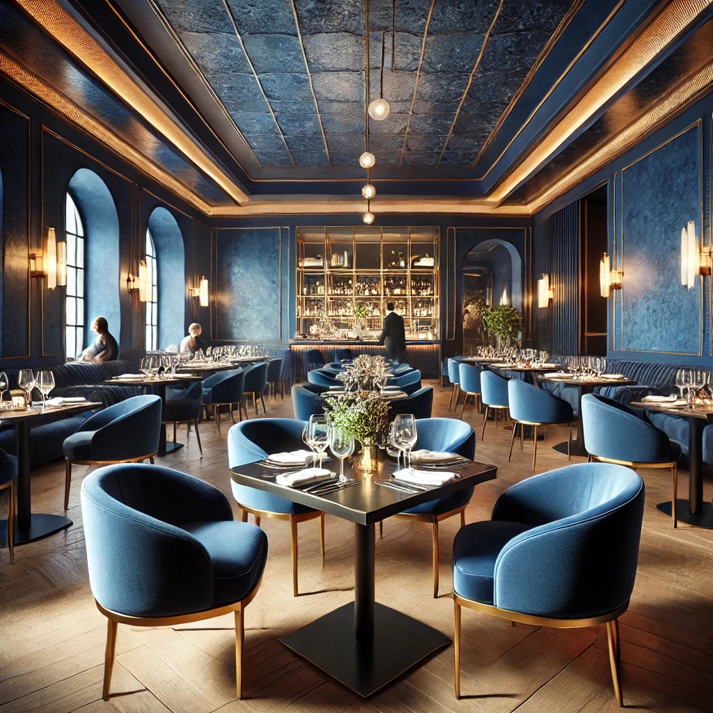
Deep blues exude sophistication and depth, evoking feelings of trust and stability while adding a touch of mystery. In high-energy dining environments, they serve as a striking backdrop that enhances the ambiance without overwhelming the senses.
Vibrant Greens: Fresh and Lively
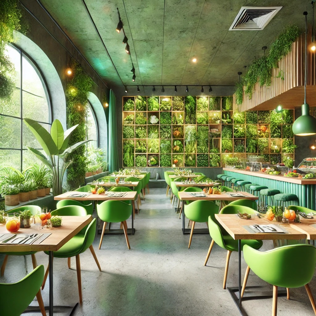
Vibrant greens bring a natural, rejuvenating feel to restaurant interiors. They stimulate creativity and create a sense of balance and harmony. Bistros and fusion restaurants often use vibrant greens to energize diners and complement a fresh culinary experience.
Rich Purples: Luxury and Creativity
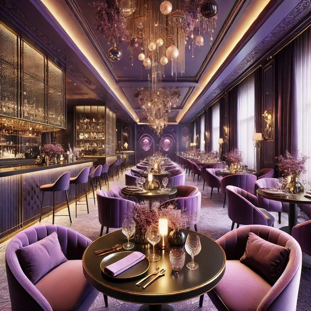
Purple hues are associated with luxury and artistic flair, transforming dining spaces into unique, memorable environments. Rich purples work particularly well in upscale restaurants, innovative eateries, and specialty dessert shops, adding an air of opulence and individuality.
Balancing Bold with Neutral
While bold colors make strong design statements, balance is essential to avoid overwhelming guests. Here's how to achieve harmony:
- Use bold colors as accents – Incorporate deep blues, vibrant greens, or rich purples on feature walls, furniture, or décor while keeping the base palette neutral.
- Pair with neutrals – White, beige, or light gray tones can temper intense hues, creating a balanced yet dynamic atmosphere.
- Layer different shades – Using various shades of bold color adds depth and visual interest without making the space feel monochromatic.
- Consider lighting – Proper lighting enhances or softens bold colors, allowing flexibility in the dining atmosphere throughout the day.
Pastel Palettes: Soft and Inviting
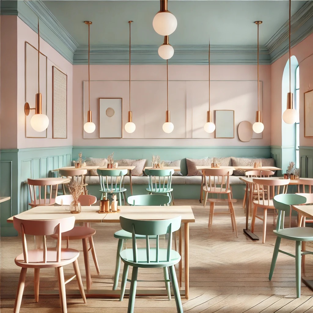
Rising Popularity in Dining Spaces
Soft pinks, baby blues, and mint greens are gaining traction in casual and fine dining establishments. These gentle hues foster a welcoming ambiance, extending beyond walls to influence furniture, tableware, and even menu designs.
Creating Instagram-Worthy Nostalgia
Pastel colors strike a balance between nostalgia and modern aesthetics. They are a favorite among social media-savvy diners due to:
- Soft, flattering lighting that enhances food photography
- A dreamy, ethereal ambiance that stands out on Instagram
- A blend of retro charm and contemporary style, appealing to multiple generations
Successful Pastel Restaurant Designs
- Rooby Fancy Kitchen – A feminine design with pastel hues, Art Deco elements, and floral bar accents.
- Piada's Lyon – Designed by Masquespacio, this Italian eatery features pastel hues with arched forms, glossy tiles, and warm wooden elements.
- The Cinnamon Restaurant (Dublin) – Kingston Lafferty Design combined soft pinks and dusty blues with bold hues, incorporating intimate velvet-covered seating and oversized lollipop-shaped light fixtures.
Color Psychology in Restaurant Interiors
Warm Colors: Stimulating Appetite and Energy
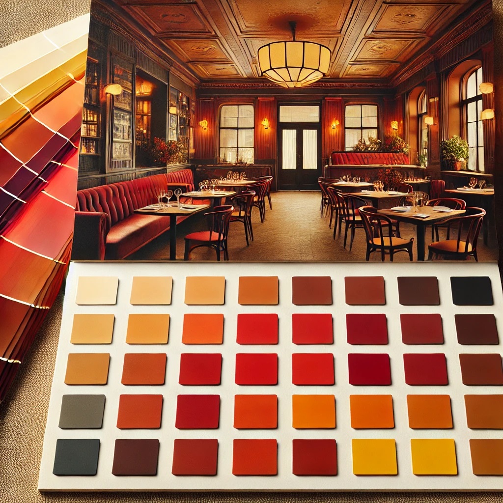
Warm hues like red, orange, and yellow significantly influence diners' psychology and behavior:
- Red – Increases heart rate and appetite, making it ideal for fast-food and fast-casual restaurants.
- Orange – Evokes happiness and warmth, perfect for dessert shops and casual eateries.
- Yellow – Associated with optimism and friendliness, often paired with red in fast-food branding to trigger impulse eating.
These colors:
✅ Create urgency and excitement
✅ Encourage quick dining decisions
✅ Stimulate metabolism and hunger
Cool Colors: Promoting Relaxation and Calmness
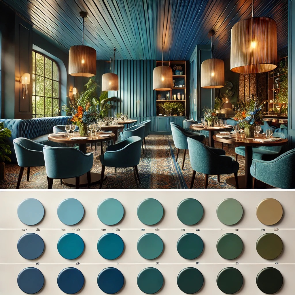
Cool colors like blue and green evoke different emotions:
- Blue – Suppresses appetite but enhances thirst, making it great for bars and lounges.
- Green – Associated with health and nature, promoting relaxation and healthy eating choices.
These colors:
✅ Foster a calm, relaxing environment
✅ Encourage leisurely dining experiences
✅ Support healthier menu choices
Neutral Colors: Elegance and Sophistication
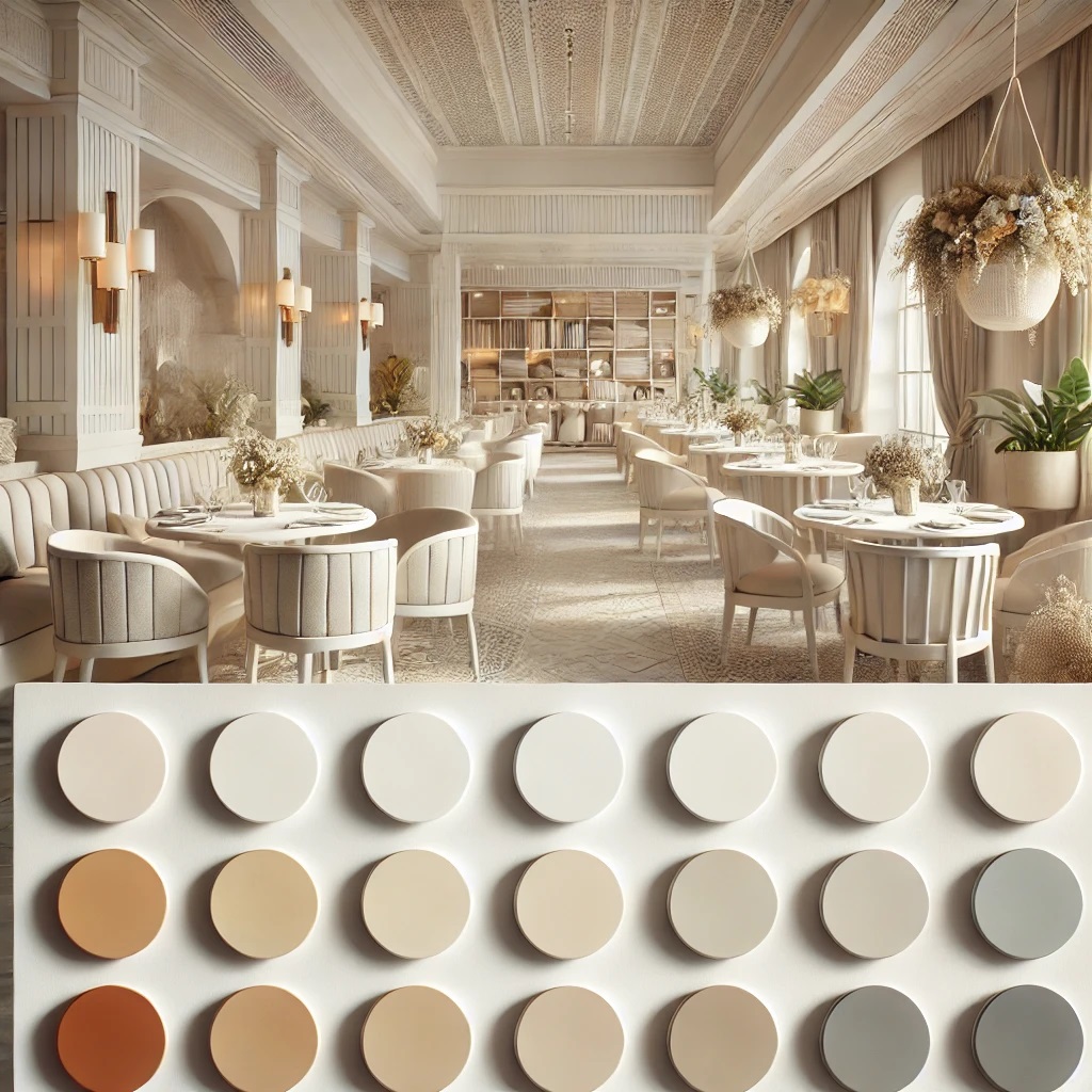
Neutral tones provide timeless versatility:
-
White and Cream – Clean, inviting, and spacious.
-
Light Gray – Sophisticated and relaxing.
These colors:
✅ Provide a refined backdrop for décor and branding
✅ Enhance food presentation
✅ Create an elegant ambiance
Nostalgic Design Themes
1950s: Bold and Classic Restaurant Interior Design
The 1950s restaurant aesthetic is one of the most iconic and easily recognizable interior styles. It blends bold colors, sleek chrome details, and nostalgic elements, creating a high-energy and timeless retro-diner look. This era was heavily influenced by post-war optimism, the rise of fast food culture, and the popularity of car culture, making diners a social hub for families, teens, and travelers.
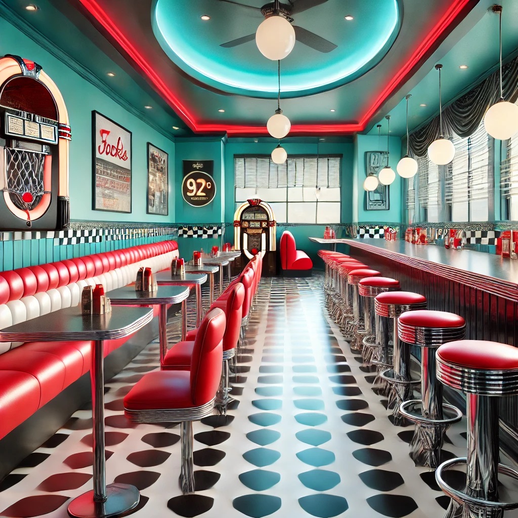
✅Black-and-White Checkered Tiles
-
- The classic checkered floor pattern is one of the most defining features of a 1950s-style diner.
- The contrast between black and white tiles gives the space a bold, retro look while maintaining a clean and polished aesthetic.
- The glossy finish of the tiles enhances the light reflection, making the diner feel more spacious and vibrant.
- Often paired with chrome baseboards to further enhance the sleek look.
✅Bright Red Seating & Chrome Accents
-
- Red booths and restaurant barstools with vinyl upholstery were a staple of the era.
- The seats were designed for comfort and durability, featuring padded cushioning and curved designs.
- Chrome accents were used extensively on:
- Diner stools with round seats and a shiny metallic base.
- Restaurant Booth trim and counters, give the diner a futuristic, polished look.
- Table edges, with Formica tops in colors like white, red, or pastel hues.
- The bright red color was bold, energetic, and inviting, making it a perfect choice for a fast-paced, casual dining environment.
✅Sky Blue and Teal for Contrast
-
- To soften the boldness of red and black, sky blue and teal accents were commonly used.
- These colors appeared on:
- Wall panels or wainscoting in pastel shades.
- Neon signage with glowing blue or teal lights.
- Ceilings or diner menus, add a fresh and airy feel.
- These colors reflected the Mid-Century Modern aesthetic, which embraced softer, dreamy pastels inspired by automobile culture and American diners.
Additional Design Features
✅ Classic Diner Counter & Barstools: A long stainless-steel counter was the heart of the diner, allowing customers to sit and watch their food being prepared.
Swivel barstools with red or turquoise vinyl seats and chrome legs were standard.
✅ Neon Signage & Retro Jukebox: Bright neon signs often framed the entrance or windows, displaying the diner's name and key menu items like “Burgers & Shakes” or “Open 24 Hours”. A retro jukebox near the entrance allowed customers to play popular hits of the 1950s, enhancing the nostalgic atmosphere.
✅ Classic American Menu & Tabletop Items: Milkshake glasses, condiment holders with mustard & ketchup bottles, sugar dispensers, and napkin dispensers were always present on tables. Diners served burgers, fries, hot dogs, milkshakes, and Coca-Cola in glass bottles, reinforcing the era’s love for fast, affordable, and delicious comfort food.
Why the 1950s Diner Look Remains Timeless
Instant Nostalgia – The bold colors, checkered floors, and jukebox immediately transport people to a simpler time.
Fun, High-Energy Atmosphere – The vibrant design and music create a lively dining experience.
Durability & Practicality – The use of chrome, vinyl, and tile makes it easy to clean and maintain.
Pop Culture Influence – From movies like Grease to real-life retro diners, the 1950s diner aesthetic has left a lasting impact on restaurant design.
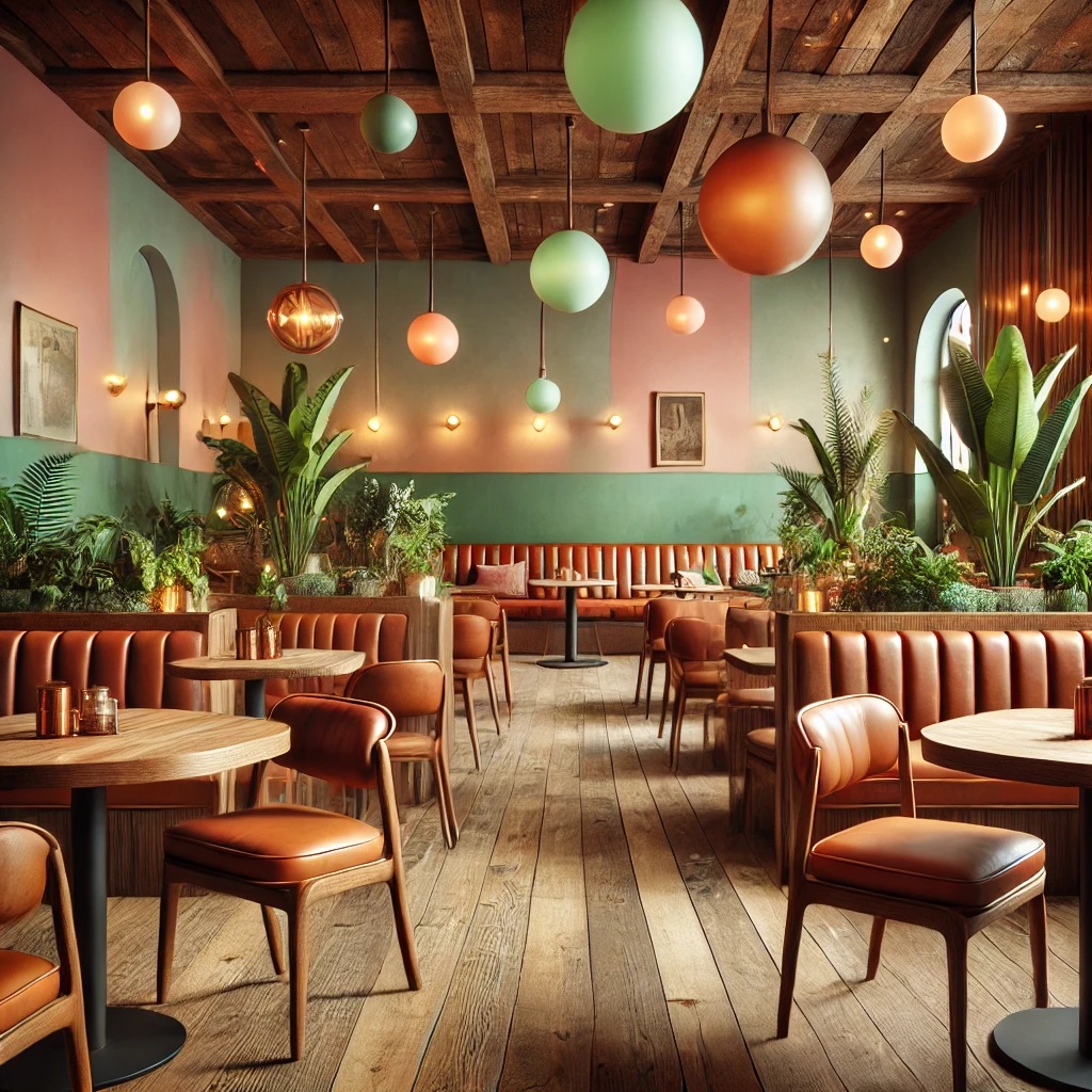
1960s-70s: Natural and Earthy Restaurant Design
The 1960s-70s restaurant aesthetic embraced a warm, organic, and calming atmosphere, inspired by nature and the counterculture movement. Interiors reflected a desire for comfort, sustainability, and earth-toned beauty.
Key Design Elements
✅ Earthy Greens, Burnt Oranges, and Amber Tones
- Deep olive greens and mossy tones created a grounding effect.
- Burnt oranges and amber added warmth and vibrancy, often seen in seating, lighting, and décor accents.
✅ Brown Leather Upholstery & Natural Wood Elements
- Rich brown leather booths and wooden restaurant chairs and tables reinforced a rustic, organic aesthetic.
- Exposed wood paneling and beams added to the cozy, inviting ambiance.
✅ Pastel Pinks & Mint Greens
- Soft pastel hues balanced the earthy tones, preventing the space from feeling too heavy.
- Often used in wall accents, dinnerware, or decorative textiles.
✅ Nature-Inspired Aesthetics
- Macramé wall hangings, rattan furniture, and indoor plants like ferns and hanging ivy brought the outdoors inside.
- Dim, amber-tinted pendant lighting enhanced the warm and intimate setting.
Why This Look Endures
The 1960s-70s earthy aesthetic remains popular due to its organic, inviting feel and timeless connection to nature, making it perfect for bohemian cafés, vintage-themed restaurants, and cozy dining spaces.
1980s: Neon and Tropical Vibrancy
The 1980s restaurant aesthetic was bold, flashy, and high-energy, blending neon lighting, pastel accents, and tropical influences. Inspired by Miami Vice, Art Deco, and retro-futurism, this style created an electrifying yet stylish dining atmosphere.
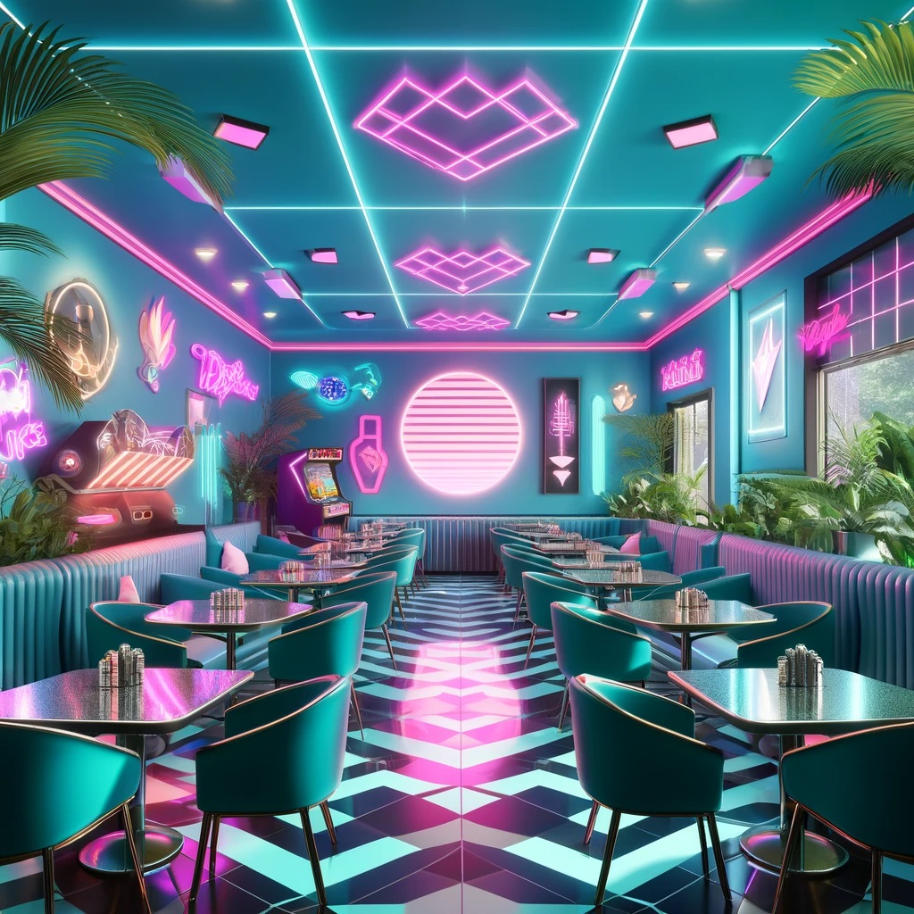
Key Design Elements
✅ Neon Signs & Vibrant Teal Hues
- Glowing neon signage in pink, blue, and purple illuminated walls and window frames.
- Vibrant teal seating and décor added a dynamic, eye-catching contrast.
✅ Pastel Peach & Gray Accents
- Soft pastel tones balanced the neon, keeping the space from feeling overwhelming.
- Gray geometric patterns and sleek finishes added a futuristic edge.
✅ Miami Vice-Inspired Tropical Themes
- Palm tree motifs, flamingo art, and rattan furniture enhanced the beachy, laid-back vibe.
- Glass, chrome, and metallic finishes created a sleek, upscale feel.
✅ Electric Atmosphere
- Backlit bar counters, glossy floors, and reflective surfaces amplified the lighting effects.
- Retro arcade machines or 80s music playlists reinforced the nostalgic experience.
Why This Look Endures
The 1980s neon tropical style remains popular for its fun, energetic, and nostalgic appeal, making it a great fit for retro diners, cocktail bars, and themed restaurants.
Practical Color Selection Strategies
Fast-Casual Restaurants
- Bright reds and oranges for energy and appetite stimulation
- Cheerful yellows to create a welcoming atmosphere
Examples: McDonald's red-and-yellow palette, KFC's vibrant red and white theme.
Health-Focused Restaurants
- Greens and browns to emphasize freshness and organic origins
- White for a clean, crisp appearance
Effect: Encourages mindful eating and healthy food choices.
Fine Dining Establishments
- Deep blues and rich purples for luxury
- Neutral tones for understated elegance
Effect: Creates a refined ambiance for leisurely dining experiences.
Cafés
- Soft pastels and neutral tones for a cozy, inviting feel
- Warm earth tones to encourage relaxation
Effect: Enhances comfort and encourages lingering.
Pro Tips for Color Implementation in Restaurant Design
Balancing Color Intensity
✔ Follow the 60-30-10 rule: 60% dominant color, 30% secondary, 10% accent.
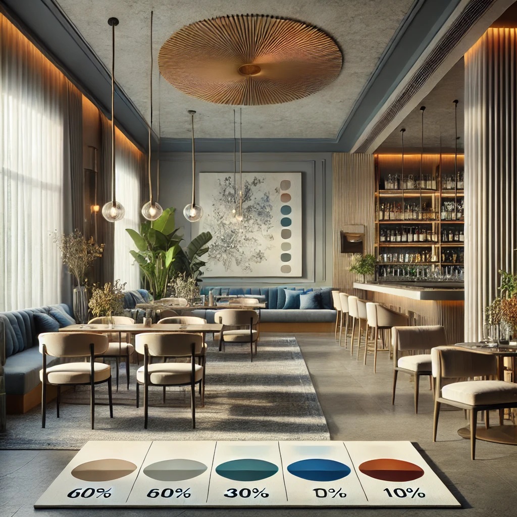
- This is the main color that sets the overall tone of the space.
- Often used for large surfaces like walls or flooring.
- Should be a more neutral or subdued hue to avoid overwhelming the space.
- Examples: soft gray, warm beige, or muted blue.
30% Secondary Color:
- Complements the dominant color and adds visual interest.
- Used for furniture, curtains, or large decorative elements.
- Can be a bit bolder than the dominant color but should still harmonize.
- Examples: deeper shades of the dominant color or complementary hues.
10% Accent Color:
- Adds pop and personality to the space.
- Used for small decorative items, artwork, or tableware.
- Can be bright, bold, or contrasting to create focal points.
- Examples: vibrant red, sunny yellow, or rich purple.
✔ Pair vibrant colors with neutrals to prevent visual overwhelm.
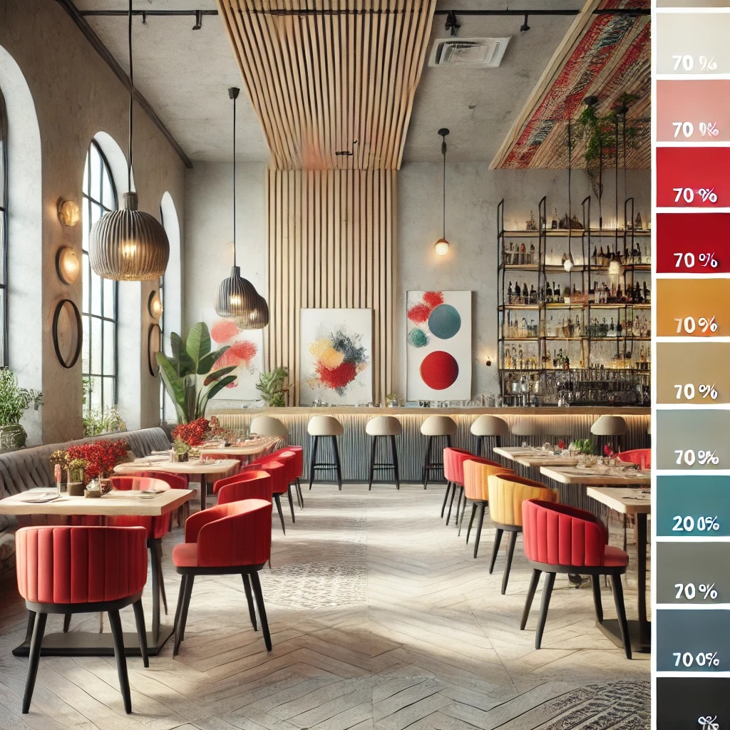
- Use a neutral base: Start with a neutral foundation like white, beige, or light gray for walls and large surfaces. This creates a calm backdrop.
- Introduce vibrant accents: Add pops of vibrant colors through furniture, artwork, or decorative elements. For example, bright red chairs against white walls.
- Balance proportions: Aim for about 70-80% neutral tones and 20-30% vibrant colors to maintain visual harmony.
- Create focal points: Use vibrant colors strategically to draw attention to specific areas, like a colorful bar or feature wall.
- Consider color temperature: Pair warm vibrant colors (reds, oranges) with cool neutrals (grays) for contrast, or cool vibrant colors (blues, greens) with warm neutrals (beiges) for balance.
- Use texture: Incorporate textured neutral elements to add depth and interest without relying solely on color.
- Gradual transitions: Use ombré effects or gradients to transition between vibrant and neutral tones for a softer visual impact.
✔ Use darker shades in intimate areas, and lighter tones in open spaces for contrast.
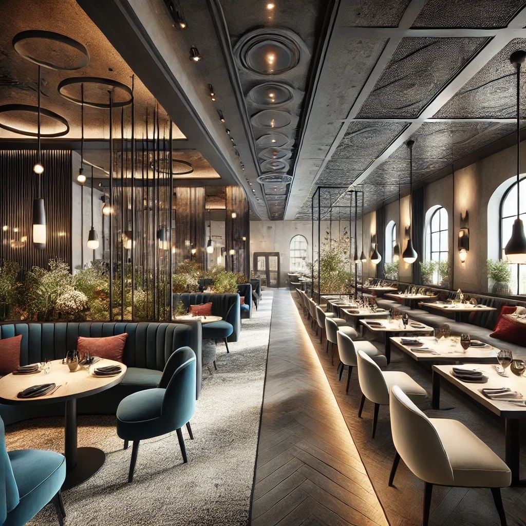
Intimate Areas (Darker Shades):
- Use in smaller dining sections, booths, or private rooms
- Creates a sense of coziness and privacy
- Enhances romantic or exclusive dining experiences
- Examples: deep navy, rich burgundy, or charcoal gray
- Can be applied to walls, upholstery, or ceiling treatments
Open Spaces (Lighter Tones):
- Ideal for main dining areas, entrances, or high-traffic zones
- Makes spaces feel larger and more airy
- Promotes a welcoming and energetic atmosphere
- Examples: soft cream, pale gray, or light sage
- Best used on walls, flooring, or larger furniture pieces
Benefits of this contrast:
- Defines different functional areas within the restaurant
- Guides patrons naturally through the space
- Creates visual interest and depth
- Allows for versatile lighting options
- Caters to different dining preferences and moods
When implementing this strategy, consider:
- Gradual transitions between dark and light areas
- Consistent design elements to maintain cohesion
- Proper lighting to enhance the intended effect of each area
Incorporating Plants and Natural Elements
✔ Greenery enhances color palettes and adds freshness.
✔ Natural wood tones complement both warm and cool color schemes.
✔ Textured surfaces like stone create depth in monochromatic designs.
Enhancing Color Schemes with Lighting
✔ Warm lighting (2700K-3000K) enhances warm palettes.
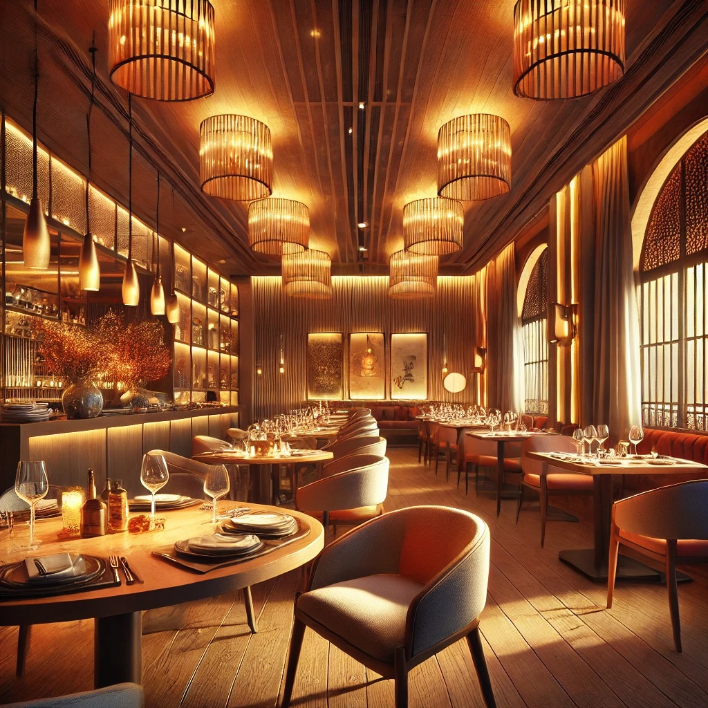
- Creating a cozy atmosphere: This color temperature mimics the warm glow of sunset, promoting a comfortable and inviting ambiance.
- Enhancing warm colors: It brings out the richness in reds, oranges, and yellows, making them appear more vibrant and appealing.
- Complementing wood tones: Warm lighting accentuates the natural warmth of wooden elements in the restaurant's decor.
- Flattering food presentation: It can make dishes look more appetizing, especially those with warm-colored ingredients.
- Promoting relaxation: The soft, warm light encourages diners to relax and linger, potentially increasing table turnover times.
- Versatility: This range works well for various dining scenarios, from intimate dinners to casual lunches.
- Energy efficiency: Many LED bulbs in this range are energy-efficient, aligning with sustainable restaurant practices.
✔ Cooler lighting (3500K-4000K) preserves cool tones.
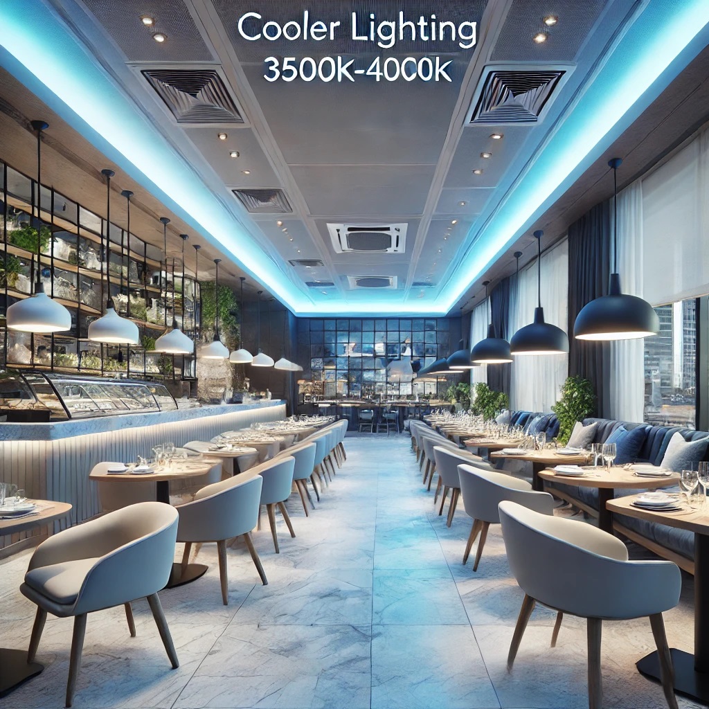
- Color accuracy: This lighting temperature provides a cleaner, crisper light that accurately renders cool colors like blues, greens, and purples.
- Modern ambiance: It creates a more contemporary and refreshing atmosphere, ideal for sleek, minimalist restaurant designs.
- Enhancing cool palettes: Cooler lighting brings out the vibrancy in cool-toned decor elements, making them appear more vivid and true to their intended hue.
- Alertness: This lighting range can help keep diners more alert and focused, which may be desirable in fast-paced or business-oriented dining environments.
- Food presentation: For restaurants serving visually striking dishes, cooler lighting can enhance the appearance of certain foods, especially those with cool colors like seafood or salads.
- Versatility: This range works well in spaces that transition from day to night, as it mimics natural daylight.
- Energy efficiency: Many LED options in this range are energy-efficient, supporting sustainable restaurant practices.
✔ Dimmable systems adjust ambiance throughout the day.
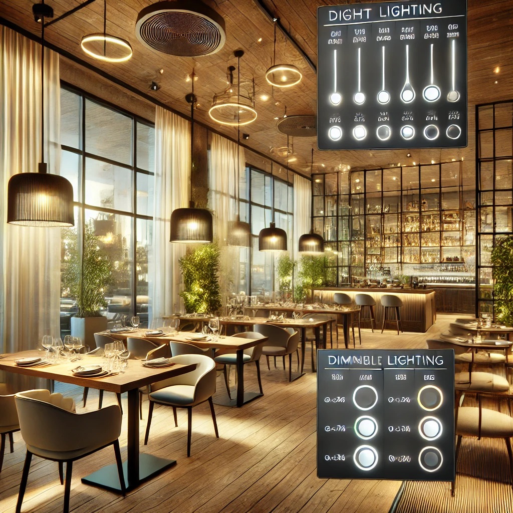
- Time-of-day adjustments: Brightness can be automatically or manually adjusted to match natural light levels, from bright daylight to softer evening illumination.
- Mood creation: Light levels can be fine-tuned to create different atmospheres for various meal services (e.g., brighter for lunch, and dimmer for dinner).
- Energy efficiency: Dimming lights when full brightness isn't needed can lead to energy savings.
- Customizable zones: Different areas of the restaurant can have separate dimming controls, allowing for varied atmospheres within the same space.
- Integration with smart systems: Many dimmable systems can be controlled via smartphone apps or integrated with broader restaurant management systems.
- Enhancing design elements: Dimming can highlight or soften specific design features as needed throughout the day.
- Improved customer comfort: Adjustable lighting allows staff to respond to customer preferences or accommodate special events.
✔ Accent lighting highlights key color elements.
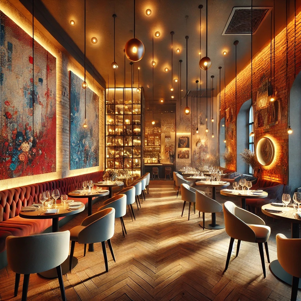
- Focal points: Accent lighting can draw attention to colorful artwork, vibrant wall textures, or unique architectural features.
- Color enhancement: It can intensify or alter the perception of colors, making them appear more vivid or rich.
- Depth creation: By highlighting certain areas, accent lighting adds depth and dimension to the space.
- Mood setting: It can be used to create intimate spots or energetic zones within the restaurant.
- Flexibility: Adjustable accent lights allow for changing the focus as needed, perhaps to highlight seasonal decor or special features.
- Contrast: It creates visual contrast, making highlighted elements stand out against the general ambient lighting.
- Brand emphasis: This can be used to draw attention to brand colors or logo elements within the space.
- Menu board illumination: In fast-casual settings, it can highlight colorful menu boards or special displays.
Final Thoughts
Color plays an essential role in restaurant design, influencing mood, perception, and even dining behavior. Whether opting for bold hues, soothing pastels, or classic neutrals, restaurant owners can create an unforgettable experience by thoughtfully curating their color schemes. By balancing intensity, incorporating natural elements, and leveraging lighting, restaurateurs can craft spaces that not only attract customers but also enhance their overall dining experience.